Course · 2022
Project A | 天使计划
A dashboard that maps social welfare data for people with disabilities across China's provinces, to help decision makers set priorities.
Summary
- Role
- Designer and developer Data analysis, design and front end
- Context
- Information Visualization Graduate course, Sun Yat-sen University
- Format
- Web dashboard
- Designed for
- Decision makers in government
Project Overview
Marking a new dawn for the Paralympic Winter Games, the Beijing 2022 Games set a brand-new benchmark for all future ones. The Paralympians’ astonishing efforts have not only drawn applause and cheers from sports enthusiasts, but also awakened the world’s awareness of building a better future for people with disabilities.
Actually, what should not be neglected is that, in China, there are still numerous disabled people struggling against poverty. Meanwhile, discrimination against them in both workplace and daily life continues to occur.
Recently, an idea came into my mind that I can use data visualization to present data related to social welfare conditions of the disabled, thus providing assistance for decision makers in the government.
As the final project of the graduate-level course, Information Visualization, at Sun Yat-sen University, I designed and developed Project A, a web-based dashboard of social welfare data of the disabled in China. The technical stacks included “Vue.js” (a progressive framework used for building user interfaces), “eCharts” (an open-source JavaScript visualization library), and websocket.
Summary
- Role
- Designer and developer Data analysis, design and front end
- Context
- Information Visualization Graduate course, Sun Yat-sen University
- Format
- Web dashboard
- Designed for
- Decision makers in government

The letter “A” contains multiple meanings, such as accessibility, assistance, angel, etc. Just as the project name indicates, I hope my project could help improve social welfare conditions of the disabled.
Here is the interface of Project A. All the data was extracted from the websites of the National Bureau of Statistics and China Disabled Persons’ Federation. Running through a data analysis process, I displayed a large amount of data with various types of charts in six containers.
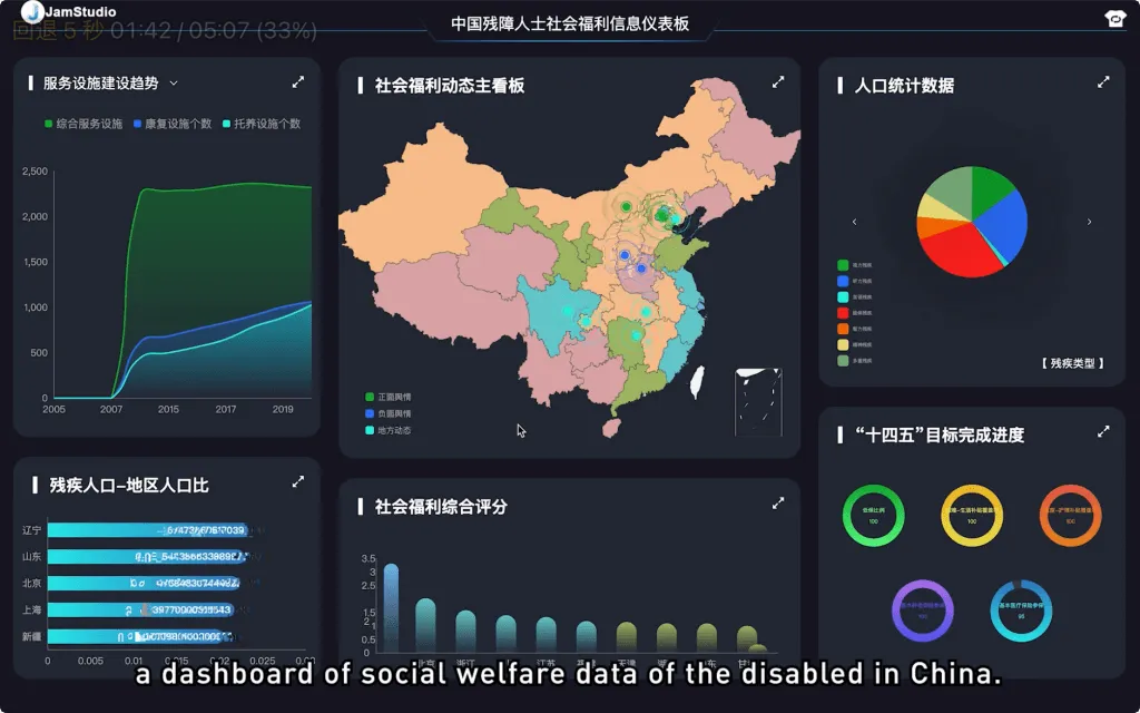
The colors of the blocks on the map represent the total social welfare score of each province, which are shown in a descending order with blue, cyan, green, orange, and red. You can check the detailed scores on the vertical bar chart below, with the bars automatically scrolling to the left side. These two charts share the same color patterns and meanings to increase the consistency.
The scatters on the map refer to the latest news about social welfare conditions of the disabled people, which are divided into three types, positive ones, negative ones, and notifications from the local Disabled Persons’ Federation.
In the upper-left corner, the line chart illustrates the trends of the construction of service facilities, social welfare scores in four dimensions, and occupations of the disabled, from 2006 to 2020.
In the lower-left corner, the horizontal bar chart illustrates ratios of the population of disabled people to the total population of each province in China, which indicates the priorities of the welfare-related work among different regions.
The pie chart depicts three demographic factors related to the social welfare of the disabled, while the doughnut chart shows China’s objectives in improving the social welfare of people with disabilities.
When hovering the mouse on the elements in charts, we can find more detailed information. You can also hover or click the labels to get more details or filter the data. Moreover, each chart can be displayed in full screen separately and the color theme of the visualization can be switched.
The most fascinating part of the visualization is that when we display it for an audience in a conference hall for example, we can synchronize the status when logging into this web page in the LAN environment. Meanwhile, data details can be freely viewed on different devices. This can maximize the effects of presentation, compared with slides.
I sincerely hope that it can facilitate the improvement of social welfare of the disabled in the near future. Feel free to contact me if you are also interested in this project.
Colophon
- Credits
-
- Zhanming Chen
- Date
- April 2022
- Methods
-
- Data analysis
- Tools
-
- Vue.js
- eCharts
- WebSocket
- Data
-
- National Bureau of Statistics
- China Disabled Persons' Federation
- Features
-
- Province welfare-score map
- Trend lines 2006-2020
- Six chart panels
- Full screen and theme switch
- Synced display over LAN
 Next project, number 4 of 6: Experience Beijing | 北京冬奥会沉浸式体验 An immersive VR experience that lets users try 2022 Beijing Winter Olympics events, such as freestyle skiing, through natural interaction. Open project